
-
「小事製作」五週年的報刊設計概念
The 5th anniversary Newspaper Design of [Les Petitis Choses Production]
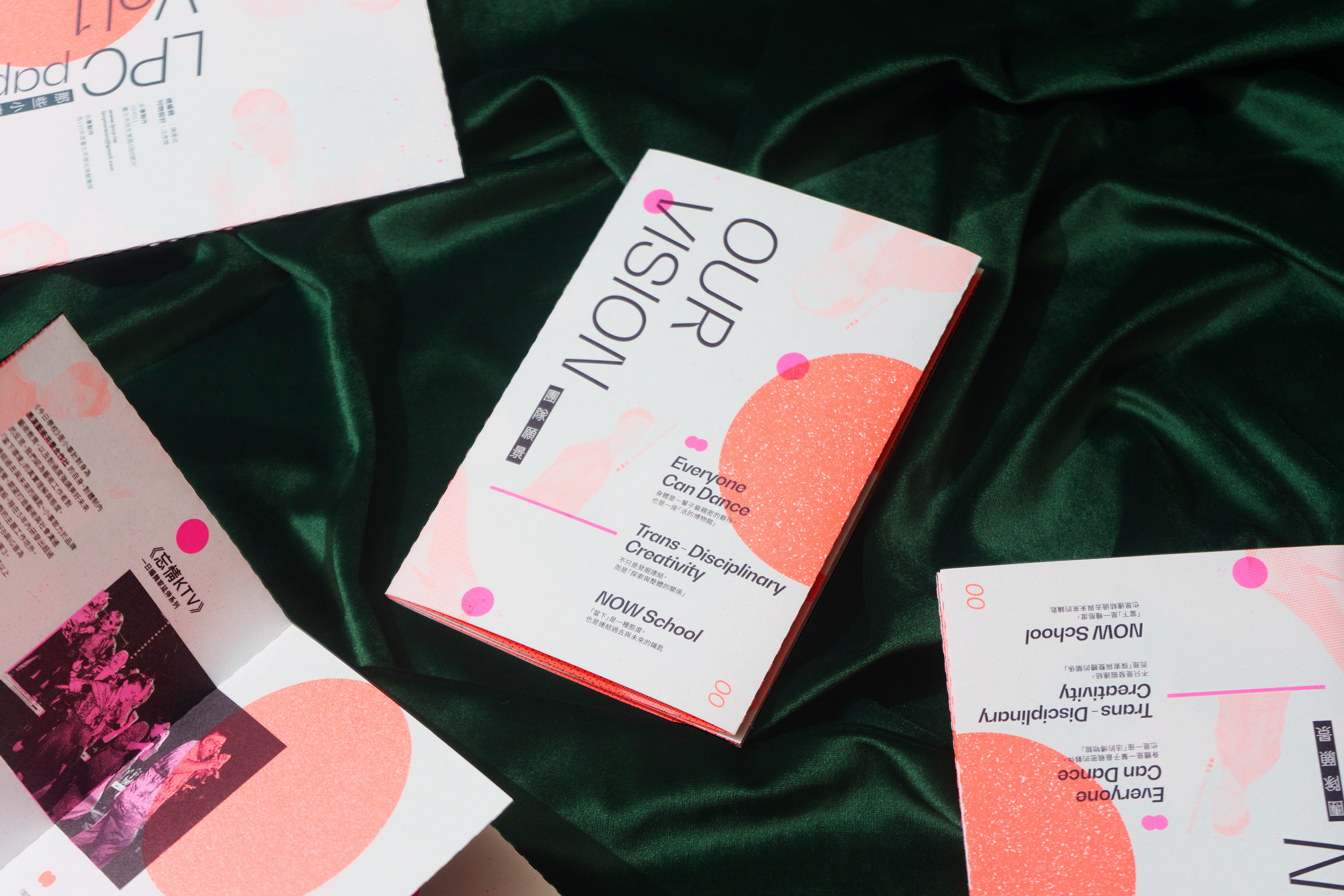
這次報刊發展的核心主軸符合舞團的三大價值主張 (人人皆可舞、無邊界的創意、與今日學校)
在篇幅有限的情況下必需透過設計排版把「小事」發生的事件以及5大部門14名創作者的合作社架構,清楚的歸納並表達其精神概念。
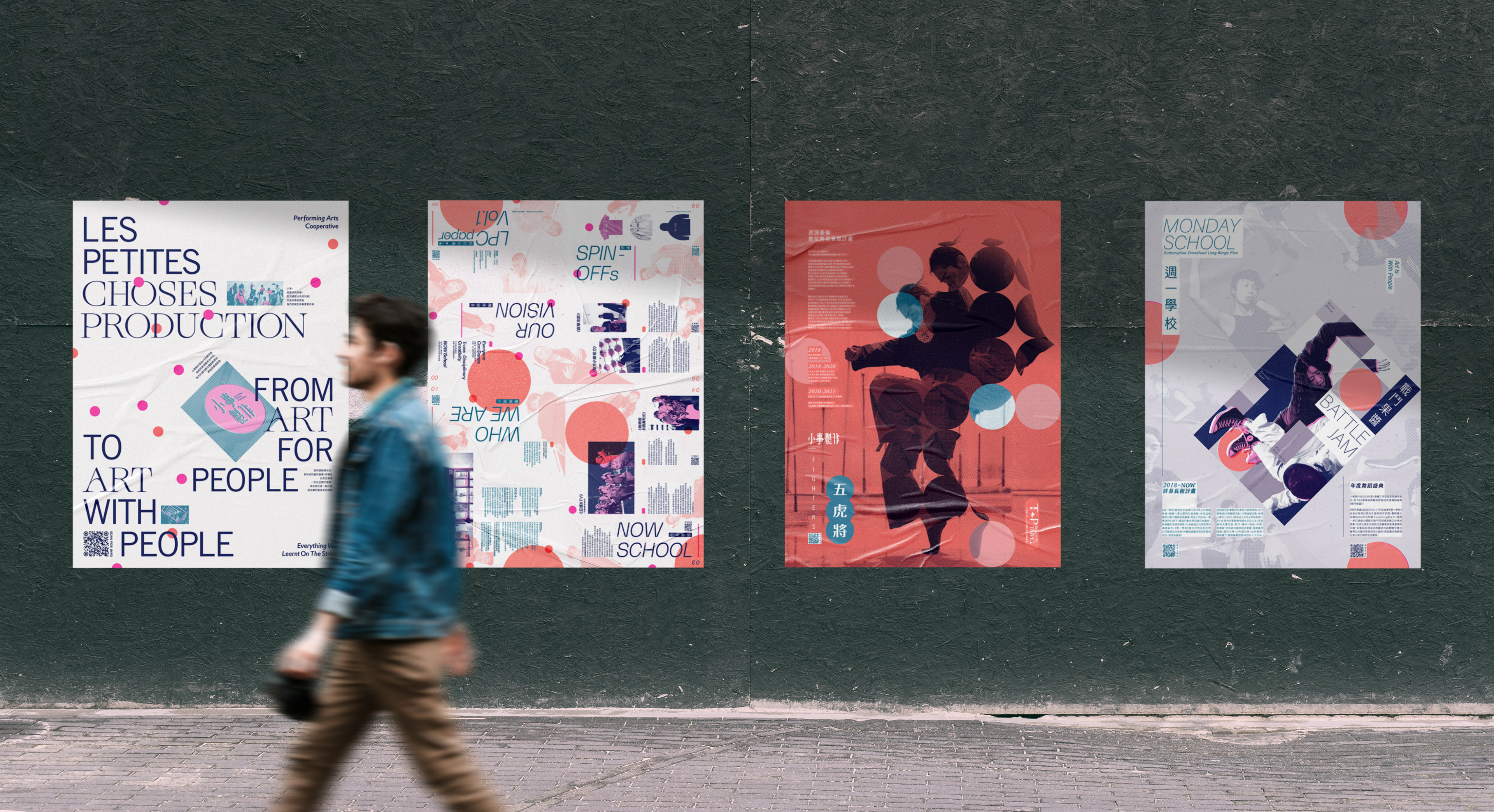
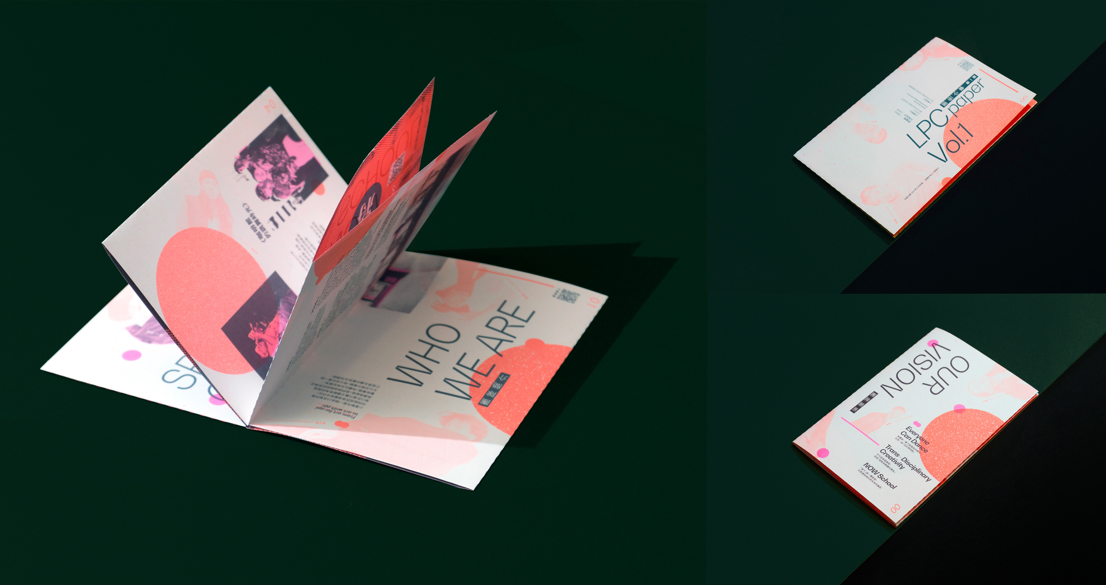
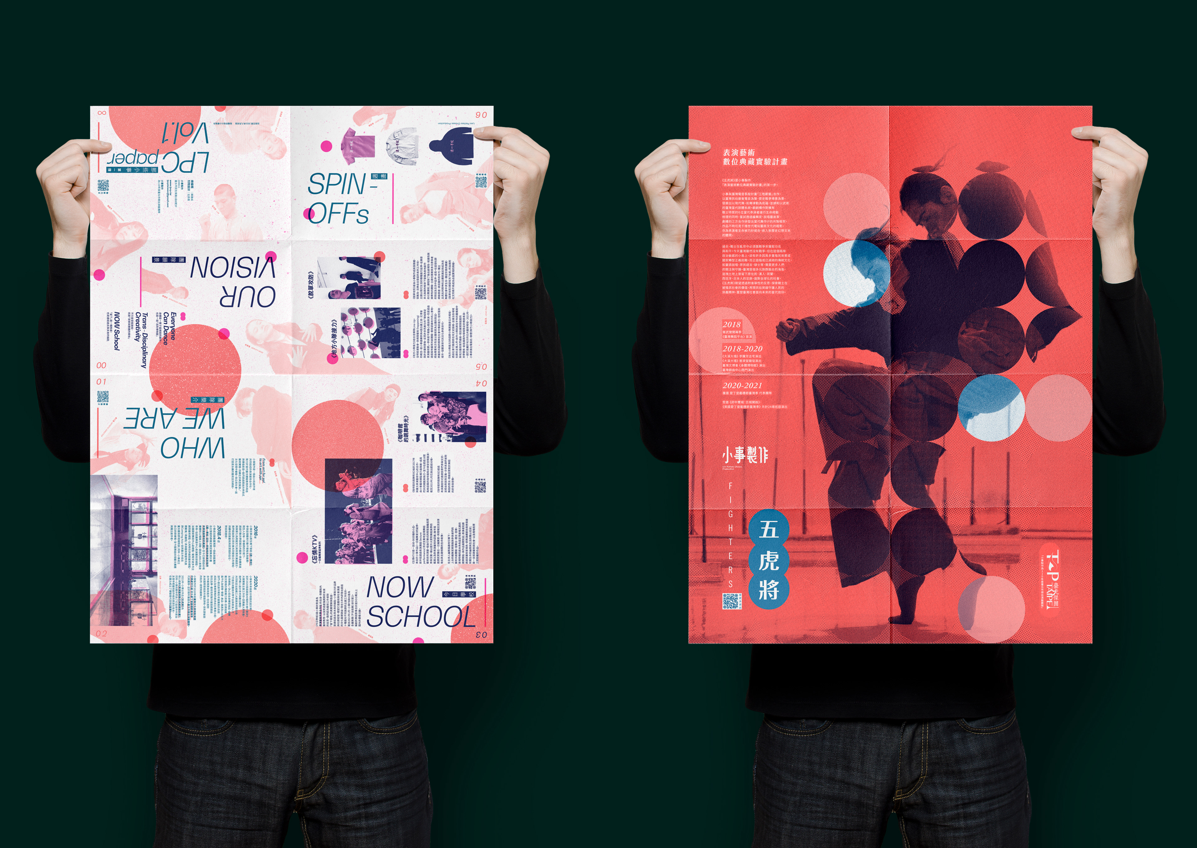
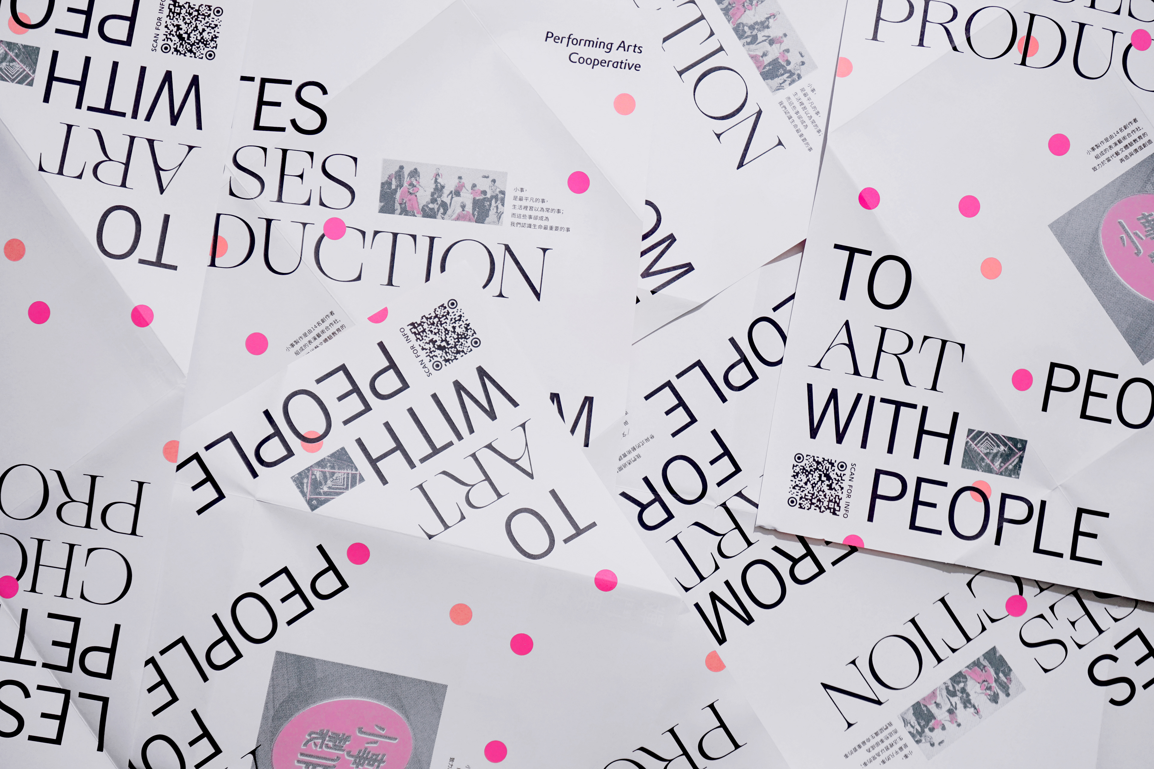
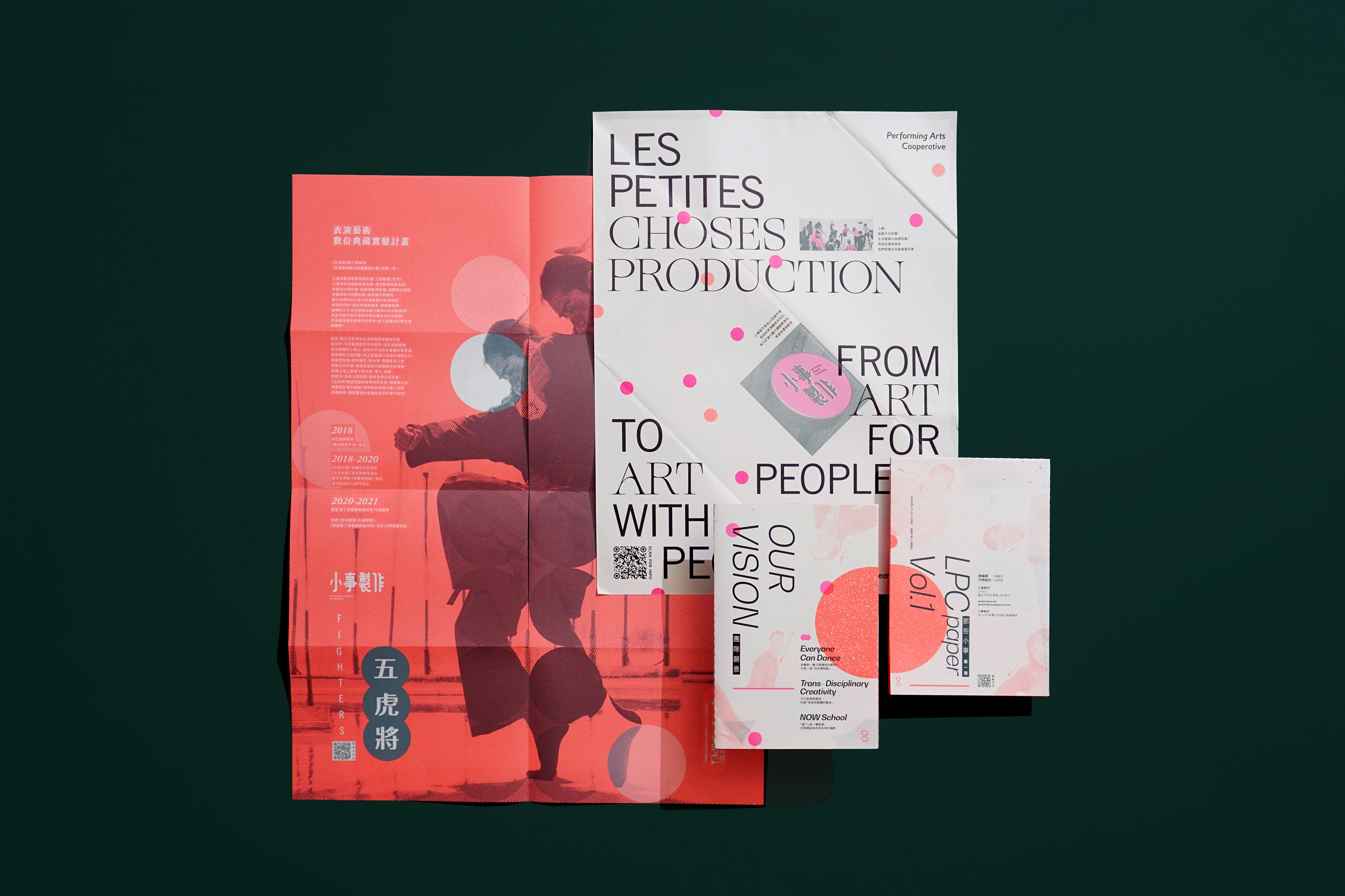
報刊是由兩張以不同方式壓褶的海報包覆而成,並分成四張不同的視覺。分別有外層海報正面、外層海報背面、內層海報正面、
內層海報背面。透過兩張海報交互摺疊的方式從創意巧思中更認識「小事」五年的經歷。也希望四種不同的視覺能依照不同的功能性
被展演張貼,但卻保持統一的風格。
The concept core axis of the newspaper has three concepts (Everyone can Dance, Boundless Creativity, and Now School).
Under condition of limited space, the events of [Les Petitis Choses Production] must be sorted out clearly by means of design
and layout, and the spiritual concept therein must also be expressed.
The newspaper consists of two posters with folds pressed in different ways, and it is divided into four different visions including
outer poster front, outer poster back, inner poster front and inner poster back. You can know more about the five-year experience of
[Les Petitis Choses Production] from the creativity and ingenuity of interactively folding of two posters. The four different visions are displayed and posted according to different functions, but they keep an uniform style.


-
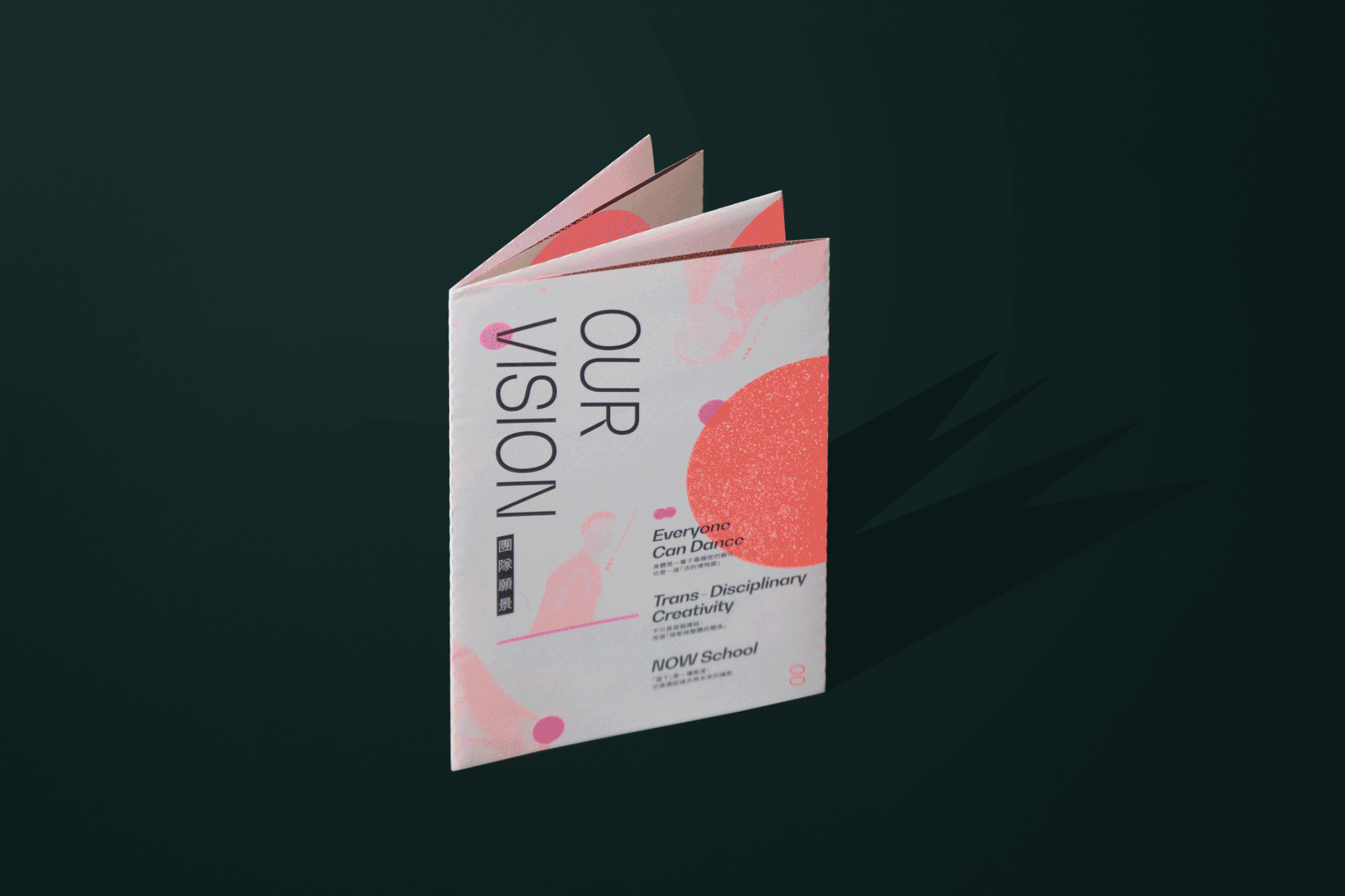
外層海報正面
從信封展開成海報即可看到小事製作的英文 Les Petitis Choses Production , 以及 from “art to people(藝術屬於眾人)
” to ’‘art with people(藝術與眾人一同成長)” 的其中之一的核心精神。
「小事」的創辦人楊乃璇曾說過:藝術並不一定能當飯吃; 但生活裡有藝術你的飯會更有滋味。
「藝術即生活,生活的藝術」也是團員的共通理想。
這本報刊以圓點為貫串整體風格的主要元素,由(外層海報正面)為起點使用小尺寸的圓點,(外層海報背面)
中尺寸的點點到(內層海報的正反面)圓點漸進式的變大,有一種聚焦深入主題的用意,同時在不同的頁面圓點以不同的顏色及大小
扮演的功能性角色也不同。
之所以選擇以圓點為主要的設計元素是因為從「小事」承接臺中歌劇院委託設計的耳機派對系列活動《酐舞樂廳》找到的元素,
同時舞團也喜歡圓點的復古元素,因此作為報刊主要的設計元素貫穿兩張海報四面視覺。
當海報摺疊成信封時,我刻意印製了一個和海報上的圓點一模一樣大的螢光粉色貼紙用來貼合信封封口並擬態在眾多的點點當中,
位置都不會一樣但又卻能融入畫面裡。每次貼上貼紙的位子都應人而異但異中求同,即表現「小事」想強調的“今日”當下的感覺。
註:“Now School”(現在的藝術家、民眾、社會需要的學校,而非過去的或未來的)
Outer poster front
You can see its English name Les Petitis Choses Production and one of core spirits of dance regiment from
“art to people” to “art with people” by unfolding the envelop to a poster.
The founder of [Les Petitis Choses Production] Yang Naixuan said, “Art cannot be food, but food will be more delicious with art in life”
[Art is life, the art of life] is also the common idea of dancers.
The newspaper takes dots as the main element throughout the overall style. It uses small-size dots for outer poster front
as a starting point, and the dots become bigger and bigger from medium-size dots on outer poster back to the dots on inner poster front and back with an intention of focusing on and going deep into the topic. At the same time, the dots on different pages play different functional roles according to different colors and sizes.
The reason of choosing dots as the main design element is because it is discovered in a performance [Happy Ballroom] of
[Les Petitis Choses Production], and the dance regiment also likes retro element of dots. The rhythmic scattering of dots can add a sense of vividness of dancing, so it is used as the main design element of newspaper throughout the four visions of two posters.
When the poster is folded into an envelope, the fluorescent pink pasters as big as dot on poster are printed and made specially
to paste the envelope and hidden among numerous dots like dots. The pasters are pasted by different people, so the positions of pasting are different, but all the pasters can integrate into the picture to seek commonness among differences. It is just the feeling of “now” that
[Les Petitis Choses Production] wants to stress. Note: “Now School” (now artist, the public and school needed by society, but not past
or future)
-
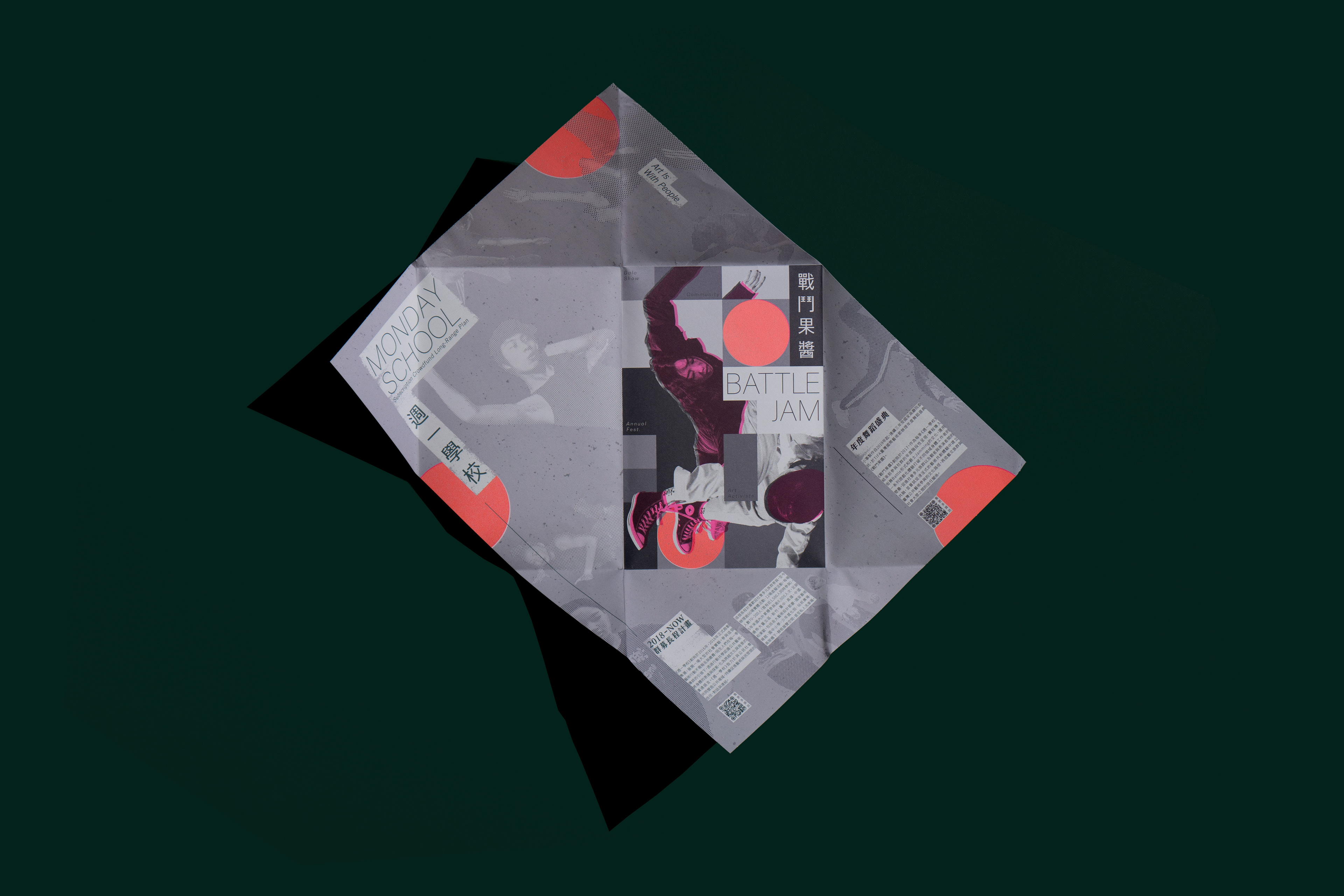
外層海報背面
2019年「小事」為《兩廳院TIFA台灣國際藝術節》戲劇院大廳量身打造的國際舞蹈盛典《戰鬥果醬》,
因此把外層海報背面的中心設計成長方形的格紋舞台,並利用大大小小的方格子色塊,將一組正在進行舞蹈比試的人、
標題與副標,穿插排版於畫面的中央。
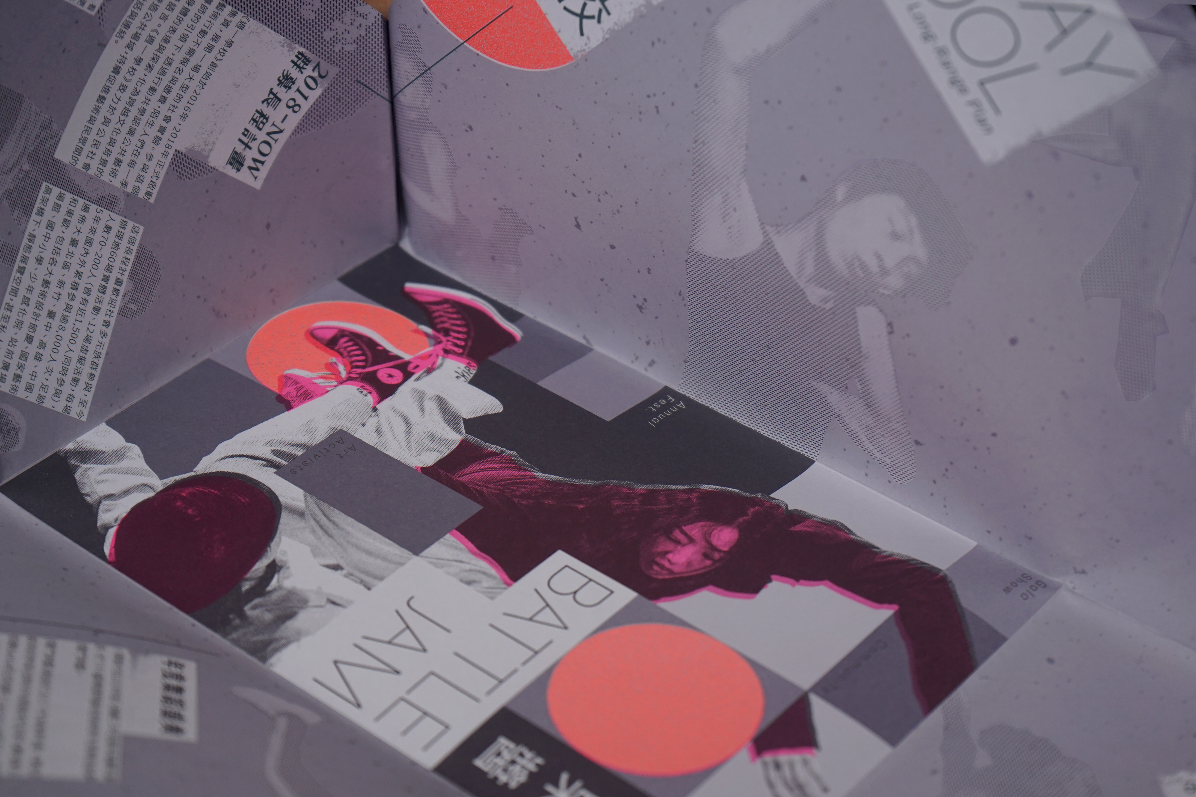
當視覺從外層海報由中心的方格舞台往外延伸,沿著摺線把四面的紙角稍微立起來,
可以隱約看到一群人圍一圈以各種形式的姿態舞動著身體。即是還原(週一學校)最初的場景。
註解:「小事製作」最初是在華山新生橋下自主發起《週一學校》,
邀請上班族或學生,也許白天做著不喜歡的工作或事情但下班後可以與他們一起跳舞,
「小事」相信無論是什麼職業或背景只要喜歡跳舞,都可以加入他們一起做自己喜歡的事。
(即是人人皆可舞)的概念。
Outer poster back
In 2019, [Les Petitis Choses Production] customized the international dance festival Battle Jam for
<Taiwan International Festival of Arts of National Theater Concert Hall>. It designed the center of outer poster back as a rectangular plaid stage. It also used uneven square color blocks to alternately put a set of persons who are having a dance competition,
title and subtitle in the center of picture.
When the vision extends outwards from the center of square stage, you can faintly see a group of people in a circle moving
their bodies with various postures by slightly putting the four paper corners up along the broken line, which is a reproduction of
initial scene ( Monday School ).
Note: [Les Petitis Choses Production] initiated Monday School under Xinsheng bridge of Huashan at the very beginning.
It invited office workers or students who were doing works or things they didn’t like in the daytime but they could dance together after work. [Les Petitis Choses Production] believes that as long as you love dance, no matter of your job or background, you can join them to do what you like and dance together. That is the concept of “Everyone can Dance”.
-
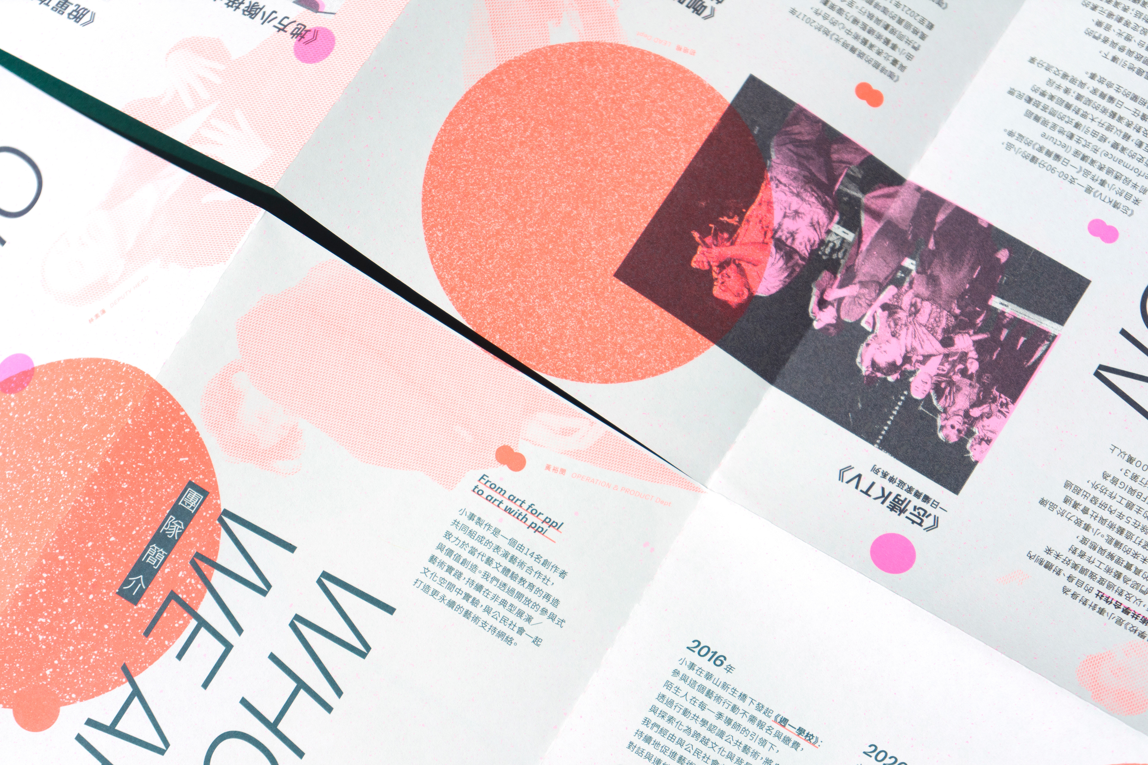
內層海報正面
希望觀眾拿到這本報刊的時候不管其本身是否有藝術背景,
都能透過這本報刊的創意,在拆開摺疊海報的過程當中都能透過不同的審美方式參與,體驗這本具有藝術性的小書冊; 呼應
(即是人人皆可舞)以及(無邊界的創意)的概念。
內層海報的正面是一本可攤開成海報的小冊子。小冊子記錄了舞團大大小小的事件記事,其中,我把團員以細斜點點的方式處理並且散落
在海報正面的每個角落為了避免制式化,當讀者翻閱這本報刊的時候不但能一邊了解小事的重要事件;同時也能在每頁找到團員的身影。
在這本報刊裡出現的四種顏色在每個頁面裡都有不同的功用:為了能讓讀者清楚分辨段落主題,以深藍色和跟深綠色的段落作為段落的切分線,不同小段落的上方會以螢光粉或螢光橘看似散落式的點點作為分段的標記。
最後閱讀完這本小冊子後可將其展開,會發現小冊子的版面配置攤開成海報依然具有美感且亂中有序。
Inner poster front
I hope that when getting this newspaper, the audients can experience this artistic manual in the process of opening the folded poster through the creativity of the newspaper, no matter if they have artistic background; it is a response to the concept of “Everyone can Dance” and “Boundless Creativity”.
The inner poster front is a manual that can be unfolded to a poster. The manual has recorded the milestones of dance regiment.
I have processed the dancers in a way of fine and oblique dots and scattered them in each corner of poster front to avoid formulation.
When reading the newspaper, the readers can not only understand the milestones, but also find out the figures of dancers on every page.
Four colors appearing in the newspaper have different functions on every page, and they are not designed casually.
In order to make the readers clearly distinguish the paragraph topics, I use deep blue and deep green paragraphs as parting lines
of paragraphs, and use fluorescent pink or fluorescent orange seemingly scattered dots above different subparagraphs
as mark of paragraphing.
Finally, you can unfold the manual after you finish it, and you will discover that the layout of manual still shows a sense
of aesthetic and is orderly in chaos.
-
內層海報背面
《五虎將》是「小事」當前主打的表演。因為曾經親臨體驗觀賞這場精彩的演出,想記錄下舞者擺動身體的殘影的過程感覺像是動態的感覺,因此以不同大小的圓點及排列的密度來呈現舞者舞動的瞬間。
《五虎將》以紅色作為舞台及服裝的主色,但希望能增強設計感因此將其更改成螢光橘作為這本報刊的主色。
Inner poster back
[Fighters] is the main performance of [Les Petitis Choses Production] currently. Because I watched this amazing performance personally and wanted to record the process of dancers moving their bodies and make the vision like a dynamic scenario, I use dots in different sizes and density of arrangement to show the moment of dancing.
[Fighters] takes red as the dominant color of stage and clothes, but I want to strengthen the sense of design, so I replace it with fluorescent orange as the dominant color of newspaper.
-
Credit
Client - @小事製作 Les Petitis Choses Production
Chief Editor - @陳運成(Lucky Chen)
Graphic Designer - 沈彥霖 @Yen Lin Shen
Print - @感官文化
Photographer - @Zeek Wang
© Copy right
-
IG - arts_daniel
Web - https://yenlinshen-design.com
Behance - https://www.behance.net/pineapples2103